# Usage
Typically ConvexAppBar can work with Scaffold by setup its bottomNavigationBar.
The ConvexAppBar has to two constructors, the ConvexAppBar() will use default style to simplify the tab creation.
# How to use
Add this to your package's pubspec.yaml file, use the latest version  (opens new window):
dependencies:
  convex_bottom_bar: ^latest_version
1
2
2
import 'package:convex_bottom_bar/convex_bottom_bar.dart';

Scaffold(
  bottomNavigationBar: ConvexAppBar(
    items: [
      TabItem(icon: Icons.home, title: 'Home'),
      TabItem(icon: Icons.map, title: 'Discovery'),
      TabItem(icon: Icons.add, title: 'Add'),
      TabItem(icon: Icons.message, title: 'Message'),
      TabItem(icon: Icons.people, title: 'Profile'),
    ],
    onTap: (int i) => print('click index=$i'),
  )
);
1
2
3
4
5
6
7
8
9
10
11
12
13
14
2
3
4
5
6
7
8
9
10
11
12
13
14
# Supported Version
As Flutter is developing fast. There can be breaking changes, we will trying to support the stable version and beta version through different package version.
| Flutter Version | Package Version | More |
|---|---|---|
| >=1.20 | >=2.4.0 | Since v1.20, the stable version changed the Stack api |
| <1.20 | <=2.3.0 | Support for stable version such as v1.17, v1.12 is not going to be updated |
| >=1.24.0 | >=3.0.0-nullsafety.x | Beta release for Dart null safety support |
# Features
- Provide multiple internal styles
- Ability to change the theme of AppBar
- Provide builder API to customize new style
- Add badge on tab menu
- Elegant transition animation
- Provide hook API to override some of internal styles
- RTL support
# Theming
The bar will use default style, you may want to theme it. Here are some supported attributes:
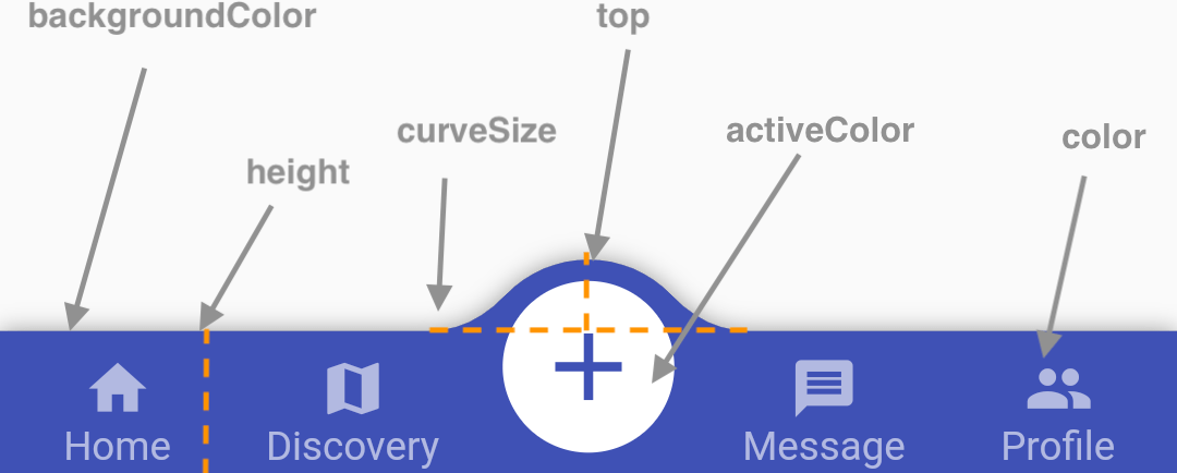
| Attributes | Description |
|---|---|
| backgroundColor | AppBar background |
| gradient | gradient will override backgroundColor |
| height | AppBar height |
| color | tab icon/text color |
| activeColor | tab icon/text color when selected |
| curveSize | size of the convex shape |
| top | top edge of the convex shape relative to AppBar |
| cornerRadius | draw the background with topLeft and topRight corner; Only work with fixed tab style |
| style | style to describe the convex shape: fixed, fixedCircle, react, reactCircle, ... |
| chipBuilder | custom badge builder, use ConvexAppBar.badge for default badge |
← Introduction Badge →